Elevating a local business
Attracting more working professionals to the business
*a project for Designlab
PROBLEM STATEMENT
Why our local businesses are dying…
During the pandemic, many local businesses had to close for obvious reasons. While many corporations doubled or even tripled their revenues, local businesses struggled to stay alive with the minimal help from our government.
Lack of exposure and understanding of the digital world, local businesses tend to forget to make their mark online starting with their responsive design.
CHALLENGE
Using current practices to uplift the experience
Creating a responsive design that aligns with consistent usability standards

ANALYSIS
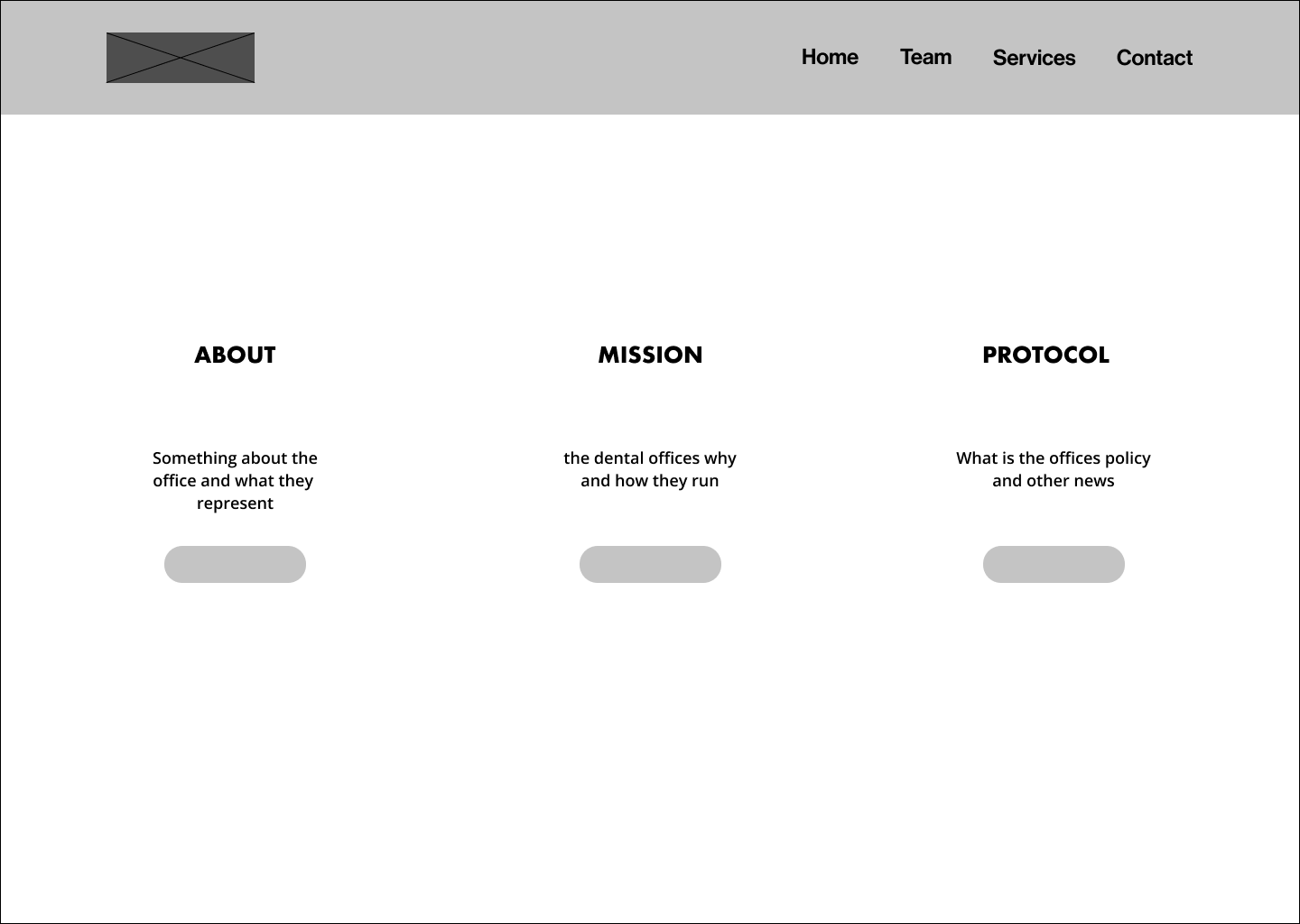
Identifying current roadblocks
There are some repetition which we can shorten so keep the navigation concise
There are some highlights keywords that is misleading because it is not actionable

More examples of using the same color as the CTAs
Another example of inconsistency usage of color and CTA
Accolades are important but the lack of other team members could feel discordant as most patients interact with assistants, front desk, and hygienists

WHERE IS THE CTA? 🤔
As a business that is trying to attract more patients, it is imperative to consistency present engagement throughout the website experience


RESEARCH
Empathizing with current users
Using user interviews and market research to better understand our customer base
USER INTERVIEWS
Conversations that create impact
What is your 1st impression of this site
What are you thinking as you look at this
What would keep you from using this site

💭 Observations during the conversations…

MARKET RESEARCH
Looking at other Seattle dental offices to focus on critical features

DEFINE
Sketches that help direct the design process
Synthesizing the research to develop the personas and identify which features are needed in the design

PERSONAS
Representing our customers
Understanding the goals & pains to identify what the design
needs in the new design


FEATURES
Giving the people what they need
Based on the research, the features that are going to be implemented are:
“meet the team”
Homepage w/”book appointment” CTA


“Meet the Team”
Presenting the entire team rather than showcasing the Dentist, it gives the user to see everyone they
will be interacting which further builds rapport and trust
Book an appointment CTA
Consistently placing CTAs have shown to increase in interacting and committing to take action, and in this case to book an appointment to be treated


BRANDING
Colors, Images, & Typography
Making simple brand and color styles to uplift the current site

DESIGN
Wireframes & Iterations
Based on the research and the features that need to be put in, I created some wireframes to explore different styles and layouts.
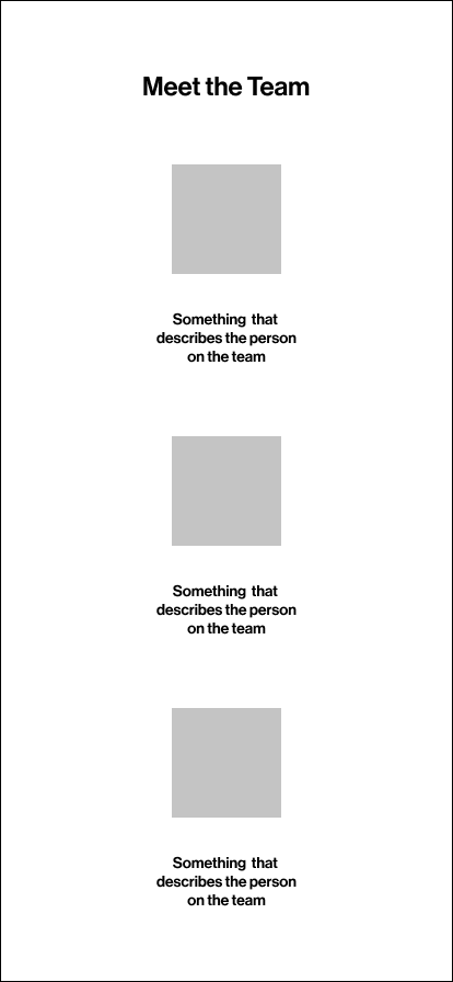
Lo Fidelity Wireframes
HomePage


Book an appointment


Meet the Team


Mid Fidelity Wireframes
Based on the research and brand style, I expanded out the lo-fidelity wireframes more visually to see the project and show the stakeholders the beginning stages.
There are different iterations of the meet the team page to see and test which iteration gets more users engaged and understand if all the information is necessary


High Fidelity Wireframes
After some user tests, I used that feedback to construct and make some changes that could make an impact:
All users enjoyed the review section as it gave more validity and trust towards the office
There were too many CTAs in the hero section
Meet the team page seem too long and the education and the certification organization seemed to “bloated”.
With those in mind, I got back to work and made some iterations and more testing can be done.


SOLUTION OVERVIEW
Practical Solutions
Making simple brand and color styles to uplift the current site
Clear and Simple IA ability to access information quickly
Using simple informational architecture to help navigate the site and complete tasks with ease


Emphasis on “Meet the Team” to provide connection and trust
Representing the showing the current members at the office help build trust between the business and the clients
CTA to book Appointments
Adding this feature will allow users to book appointments

After more user testing, I focused on honed in on the features that would benefit not only the business, but most importantly the users as well.


During the middle of iterations, I saw that 40% of users on the current site were on mobile. Even though the stakeholder did not ask for a mobile design, I made some iterations to see and help mobile users as well.


FURTHER STEPS
Thoughts on the Next step…
Overall, this project was exciting because it was for a client that gave me free rein to work, but at the same time had great discussions during the design process. Some of the things I learned were:
Clear communication with Stakeholders regarding results, direction of brand, and wants/needs very important in the beginning stages
Keeping designs simple and using data to bolster the design ideas to help clients understand certain thought processes.
Some of the next steps are to involve more user testing and iterations that can make impactful changes on usability and accessibility.
Currently, the client has a contract with a design/web company regarding their management of the site, but once that contract concludes, we will be touching base again.
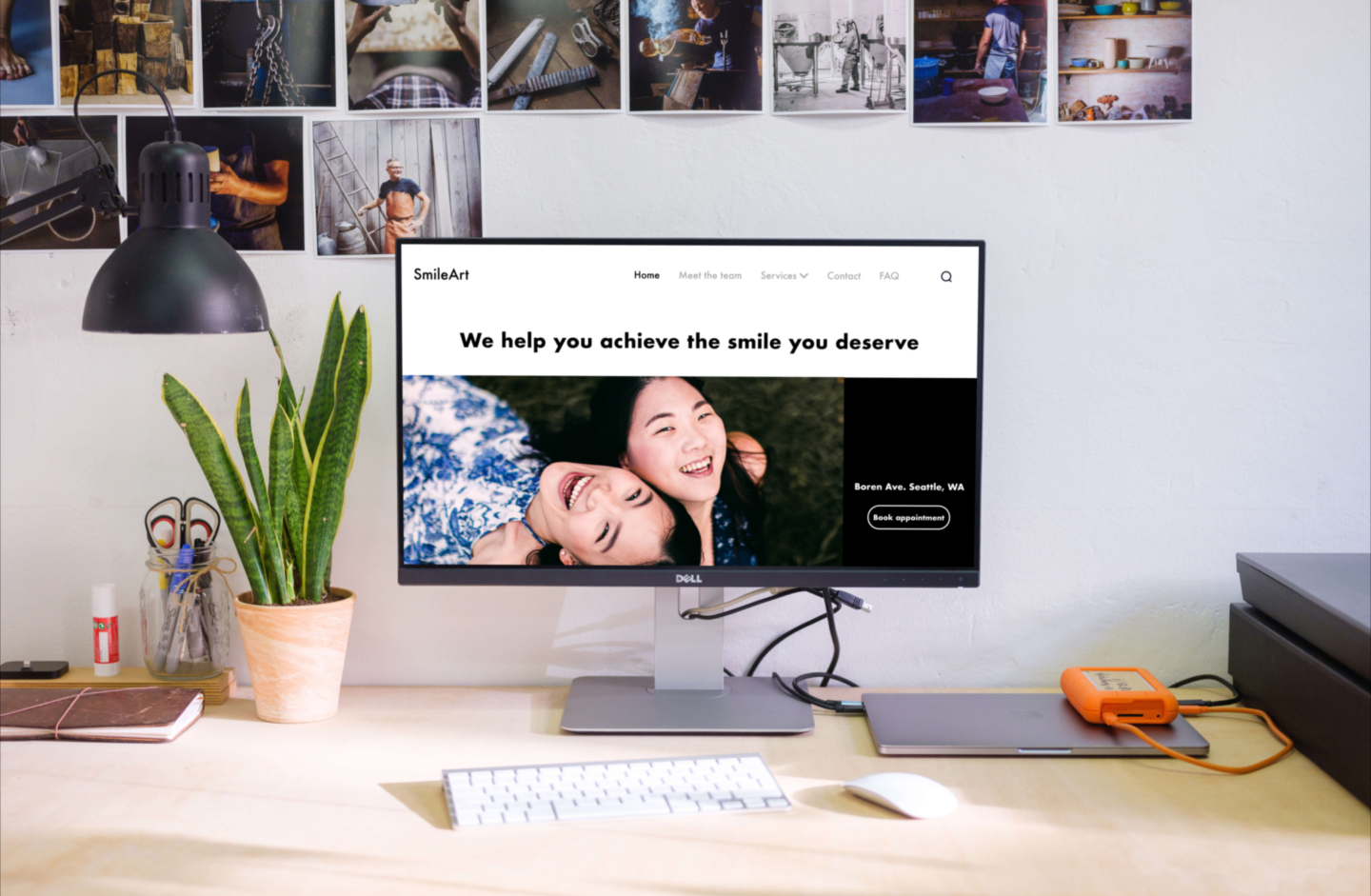
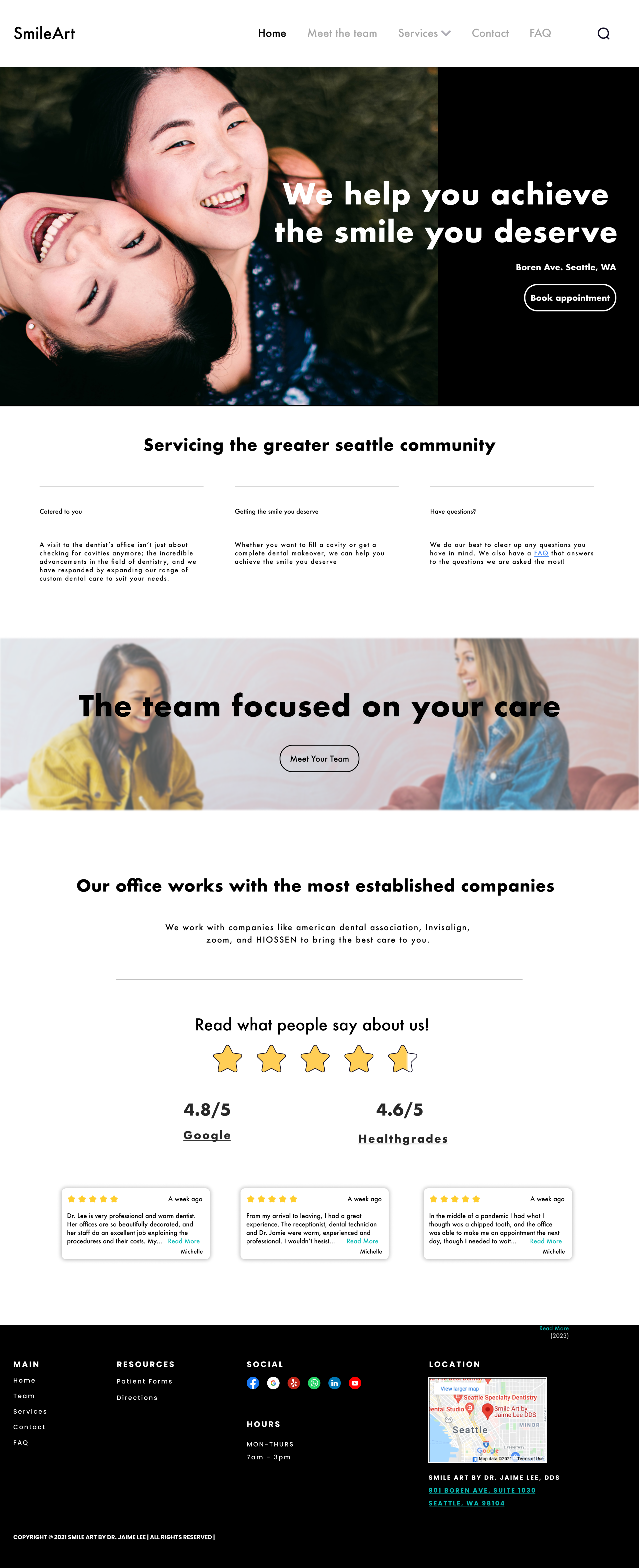
To wrap things up, here are some of the before and after throughout the process
Before

After


Before

After

