
Clarity
Helping patients manage their appointments and payments
Project Overview
A health App that keeps track of appointments, payments, and more transparency between the health offices and its patients. Clarity was designed to help people keep track of doctor, dental and other health services in the palm of the users hands. Furthermore, Clarity presents more transparent insurance breakdowns to showcase patients payment portions.
Role: Product Designer
Duration: 2 Weeks | Approx. 80 hrs.
Solution
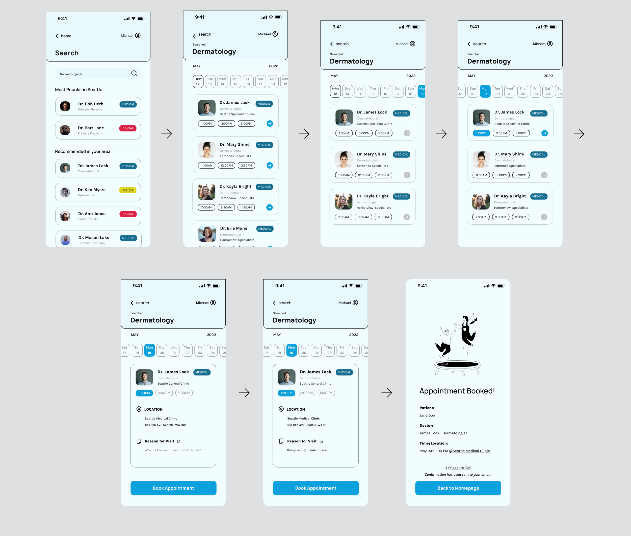
For this app, I created two simple user journey paths that allow the users to look up various health services and make appointments quickly and also make a payment for the services that were done.
Ability to make easy and fast payments (left screen)
Instead of the archaic way of snail mail, the patients can make payments quickly while having the ability to see the insurance breakdown to double check any mistakes
Making appointments with the health provider the user is looking for (Right Screen)
Instead of the archaic way of snail mail, the patients can make payments quickly while having the ability to see the insurance breakdown to double check any mistakes

Sign in

Making Appointments
Problem Statement
Keeping track of my life is hard as it is…
Historically, insurance is/can be confusing for many users. According to Etmoney*, “most people think insurance is an unnecessary expense. The reason is that we feel confident about our future and our ability to tackle unseen circumstances. But there is a huge difference between our perceived ability and reality.”
Lack of transparency and effective communication between the health services, insurance companies, and their patients create friction.
Design Process

Discover
Gathering Data: Asking users(10) if they use mobile, web, or B2C methods to communicate with any type of healthcare processes.
Based on the data: Most use the web or call to create appts to their healthcare providers - only due to the lack of usability of an app or lack thereof. With the same users, in most cases they make the payment online(web) or at the office/hospital.
Extra Insights: A few users presented a thought/idea of having an app would greatly make their day-to-day much easier with an app because going into the office or calling to give CC info can be “nerve-racking”.
“As a mobile user, it is difficult to make appt with my local dentist...it can be frustrating because I am on the go constantly”
Define
With the data gathered from the users, I wanted to focus on 2 feature priorities:
1. Making an appointment
2. Ability to make payments for a visit/procedure.

Comparing the process of the apps I currently use the most that have functionality of making appointments and payments on an app; Solv, Airbnb, and Philz Coffee.

Although Airbnb and Philz Coffee aren't related to healthcare, I wanted to explore the apps that processed the purchasing or making payments and reservations.
The features helped with constructing the user journey and flow.
Develop
Initial wireframes: With competitive analysis and inspirations, I wanted to create some impactful iterations with the limited time on this study. So the focus was on the sign-in, homepage, calendar/appointment, and booking an appointment flow.
Sign-in Iterations
With the quick sketches I made, it was transformed into basic wireframes to give it more structure and body
Some of the explorations were looking at the least frictionless and familiar ways to sign in

Homepage Iterations
I particularly enjoyed the creation of the homepage. To create an interesting way to represent the usage of insurance with a dial (inspired by the Apple activity dial). I wanted to separate each healthcare provider so the user might be able to view with clarity and focus without being confused. So the use of tabs to separate each category instead of creating a separate page for each category.

Keeping track of insurance and understanding can/is a difficulty that many people struggle with. In order to create more transparency between the insurance company and its clients, the breakdown of treatment features may enlighten some things that may not be clear before paying for the rest of the treatment. (To be tested and data gathered during the user interviews). Furthermore, to be able to pay for the treatment on the app rather than waiting for the bill to arrive via snail mail.
Calendar/Appointment Iterations
When creating the process for “making an appt”, I heavily relied on competitive analysis and other inspiring mediums. Presenting the users with a calendar to make an appt, the users performed well due to familiarity and its functions. Also, I explored a few different methods to show “upcoming appointments”, such as the hierarchy of information that needs to be presented.

Exploring different options for presenting upcoming appointments was mainly inspired by Google calendar and Apple calendar.

Deliver
For this project, I had the privilege of working with 10 users within the age range of 25-33. I specifically found users in different parts of the workforce in healthcare, service industry, students, and in tech.
Focused on 3 user flows :
Initially, I had focused on 2 features but I want to explore and learn to develop an effective sign in flow.
User flow 1: Signing in and/or creating an account

For the initial tests, I primarily focused on the flow. 9/10 users succeeded in finishing the flows without any errors.
I asked for some feedback not regarding the flow to get an idea of how the branding and assets will come together towards the end.

User Flow 2: Patient wants to schedule an appointment with their health care professional.


User flow 3: Patient wants to make a payment for a recent transaction.


Some additional feedback I received were:
1. The cards seem to be inconsistent between CTA and the informational cards.
For example, within the book appt flow, the “my doctor” section had the star in the top right corner to represent that is “saved/favorites”. While on the next page of the flow, there is no option to “save/favorite” the doctor, but instead “highly rated” icon is placed instead.
2. On the homepage, 8/10 users preferred the horizontal activity bar rather than the circular dial that represents the amount of insurance used.
3. 8/10 users preferred the CORAL/ORANGE color CTA. The cyan was harsh to the eyes of the users.
Synthesizing Data to make more iterations
By collecting and synthesizing the feedback that was received, I went back to the lab to iterate for another round of user testing.
To create a better hierarchy and focusing on the feedback from the previous user testing, there were 5 main things that were implemented.
Separating the headers from the body to help users focus on the task at hand
Creating tags for different healthcare providers, to help the users identify them to re-enforce familiarity and confidence
Present quick time availability for each provider. Allows the user to see what times each provider is available to quickly make a choice without the hassle of going back and forth by opening up each provider's site.
Different approach with the calendar. While finding the right time for the user was important, 7/10 users feedback related to finding the doctors as a priority when it came to healthcare providers. Within the flow, I prioritized finding a doctor first and then the time to match a user's schedule. While the search option finds the optimal healthcare provider, it would match the time/date within a calendar week. The user would have the ability to find a different type/date by selecting the month/year accordingly.
Finished task page: A confirmation page when a task is completed.
Results
While this is an exploration, I find that a successful metric to a case study would be the satisfaction of its users and how well user flows were completed. The most recent iteration of this project received well in the final round of user tests.

10/10 were able to complete the tasks given (testing 3 user journeys)
9/10 users reported the overall message of the app was clear through color, fonts, and icons, essentially the branding
9/10 users preferred the final iteration of the calendar over previous iterations in terms of fluidity and structure.
10/10 users were curious how the chat/call feature was going to look like in the Homepage section

6/10 users wanted to see more regarding the insurance breakdown portion. Curious to see how this feature would affect their experiences in tracking their insurance usage
One user suggested a creation of a dock for this app, as it might be easier to navigate.
With more time, I would love to build out the insurance breakdown page, chat feature, and its usability.
Furthermore, I would want to create a dock so it would be much easier to navigate from page to page so the IA would be more concise and more visible.
Prototypes

Sign in

Making Appointments

Payment